.webp)
With mobile traffic now accounting for over 60% of website visits, it’s more important than ever to ensure your design is responsive. Figma offers a range of powerful tools that make creating responsive layouts simpler across all screens.
Some of the Figma responsive design best practices are:
- Utilizing frames and layout grids to define different screen sizes
- Applying constraints to control how elements resize
- Using Auto Layout for flexibility.
You also need to optimize typography and organize your design layers clearly.
For more tips on mastering Figma design system best practices, check out our full blog!
Key Takeaways:
- Figma’s frames, grids, constraints, and Auto Layout simplify responsive design. These tools help you build layouts that adapt quickly.
- Using variants and realistic data makes your designs more practical. You can test different states and swap elements easily.
- Collaborate earlier with developers to avoid miscommunication and ensure smoother handoffs for a truly responsive website.
What is Responsive Design Actually?
Responsive design is an approach that ensures a website adapts to different devices, offering a seamless experience for users.
It uses media queries and relative units to adjust the layout automatically based on screen size. These make content always accessible and easy to navigate.
With responsive design, you can reach a broader audience and save time by working on one version of the design.
You can improve SEO with mobile-friendly content and maintain brand consistency across all devices. This approach is essential for modern web design.
Why is a Responsive Figma Website Design Important?
It's essential for improving user experience, engagement, and conversion rates. Here's why it's crucial to ensure the best use of Figma:
Improved User Retention
Responsive websites are easier to navigate, increasing user retention. Visitors are more likely to stay longer if the site adapts to their device, improving overall engagement.
Higher Conversion Rates
Responsive designs help drive 11% higher conversion rates. When users can easily navigate and complete actions on any device, your chances of driving conversions rise significantly.
Mobile Traffic Dominance
Mobile traffic accounts for over 55% of website visits. As more users access websites on mobile, responsive design ensures your site is optimized for that key audience.
Efficiency in Design and Development
Designing mobile websites reduces the time spent fixing layouts by up to 30%. Using tools like Figma’s auto layout and constraints streamlines the process.
8 Best Practices to Make a Figma Website Truly Responsive
Enhance your web design with these 8 Figma best practices to deliver a smooth user experience to your target audience
1. Design With Frames Instead of Groups
Frames form the foundation of responsive design in Figma. A frame acts as a container that defines clear boundaries, dimensions, and layout rules.
Through these frames, you apply constraints, grids, and Auto Layout, which makes them essential for building adaptive interfaces.
Start by creating frames for key device sizes. Such as-
- Desktop at 1440px
- Tablet at 768px
- Mobile at 375px.
By this, you can visualize every breakpoint directly on your canvas. Use the Frame Tool (F) and select preset sizes for quick setup.
2. Utilize Constraints and Variants
When you are working to make your Figma a bit more responsive, this is the time to use the constraints in Figma. It is included as one of the best mobile web design practices.
They basically help UI elements remain anchored or scale proportionally as the frame resizes.
For example, if you are setting a button’s constraints to Bottom and Center, it will always stay at the bottom, no matter how the frame size changes.
To apply constraints,
- Select the layer and use the Constraints section in the Properties Panel.
- You can set elements to stick to the top, bottom, left, or right, or make them scale proportionally with the frame.
Now at this stage, you have to design flexible components that adapt to different situations. That’s where variants step in.
What is the benefit of it?
You can group the related elements together and just switch them effortlessly.
For example, you can create button variants for default, hover, and disabled states. They can easily swap between them while keeping the same structure
3. Work With Grids and Columns
Layout grids in Figma are essential when you want to align content. You can apply grids to frames and components.
It offers every element to stay aligned, regardless of screen size. In Firma, you will find various grid types:
- Uniform grids
- Columns
- And rows.
Each grid can be fixed or fluid, adjusting dynamically to the screen size.
Pro Tips: Use fluid grids with up to 12 columns for flexible layouts. Besides, margins and gutters create spacing and offer consistency between elements.
Make sure to use a 4-point grid system to ensure uniformity in spacing, which is key for readability.
4. Use Auto Layout Strategically
If you're creating components like buttons or cards that need to adjust as content changes, Auto Layout is essential.
For example, if you're designing a button, use Fill for text to make it expand and Fixed for the button’s height, keeping it the same regardless of content.
For text boxes, Hug allows the box to shrink or grow depending on the content. Test by resizing components early. It helps you spot issues and fine-tune responsiveness before finalizing.
5. Test Across Industry Standard Breakpoints
If you're aiming for responsive designs, breakpoints are essential. They define when your layout should adjust based on the screen size.
For example, a three-column layout on a desktop may collapse into a single column on mobile.
In Figma, use separate frames for each breakpoint. Adjust the layout as needed for each. You can define min-width and max-width for each breakpoint.
It ensures your design adapts smoothly to various devices. Breakpoint tokens make it easier to test and apply these changes quickly, keeping your design consistent across platforms.
6. Integrate Realistic Data
Integrating realistic data into your designs helps make prototypes more dynamic. In Figma, you can simulate data (like stock prices or user profiles) by using plugins or CSV imports.
This lets you visualize how the design will behave with actual content, improving the user experience.
For example, instead of placeholder text in a user dashboard, you can populate it with actual user names and avatars from a CSV.
You can make your designs more interactive and realistic for testing across breakpoints. This helps you test layouts, check overflow issues, and see how real content behaves across different breakpoints.
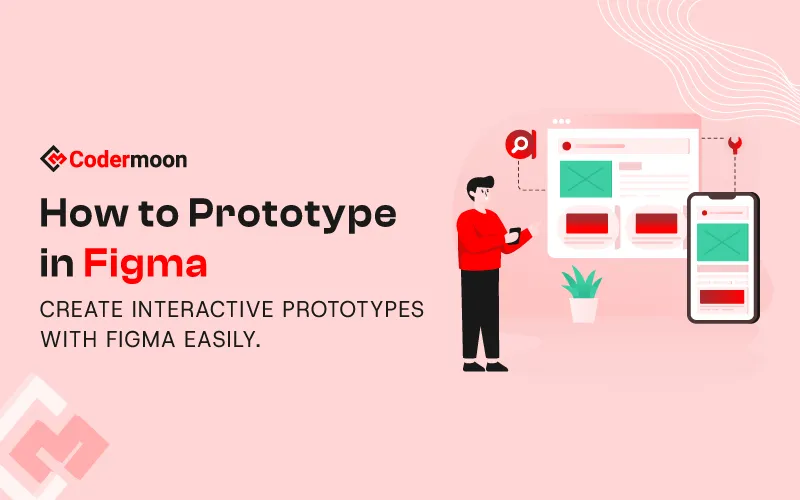
7. Create Responsive Figma Prototype
Focus on making prototyping, especially when you're preparing for responsive design. It helps you visualize how your layout adapts across devices.
- Switch to Prototype mode to create interactive flows by linking frames and setting triggers like button clicks or hovers.
- Add animations such as dissolve, move, or slide for smooth transitions.
- Test your design by clicking Present to check interactions in real-time.
- With interactive components, you can reuse actions like hover or click across variants.
- Finally, share your prototype with stakeholders, gather feedback, and refine your design before development begins.
8. Collaborate With Developers Early
At this stage, when you're just beginning the design process, collaborating with Figma developers is key. It helps bridge the gap between design and functionality.
By working together early, you can ensure that your responsive design will be feasible and adaptable when it’s built.
Discuss constraints, layout behaviors, and interactions with developers and ensure everyone is aligned on how elements should resize or adjust across devices.
This way, you can easily prevent misunderstandings later and save time during handoffs. The final product meets both design and technical requirements.
To get a quick overview, you can utilize this video:
Make Your Web Design Responsive in 10 Minutes | Figma Tutorial
5 Core Principles of a Responsive Figma Web Design You Must Know
The followings are the essential principles that help you build truly responsive Figma web designs.
1. Typography
Typography plays a crucial role when you are creating a visually consistent and readable design.
In Figma, Text Styles allow you to define specific properties like font family, size, line height, and letter spacing.
By using these styles across your design, you ensure uniformity and ease of scaling.
For example, if you update a font size in the style library, all instances of that style are automatically updated. It saves both time and effort.
2. Visual Hierarchy
Visual hierarchy is key to guiding your users’ attention to the most important elements of your design. It helps you prioritize content so users know where to focus first.
For example, you might make the main heading larger, so it stands out right away, while using contrast to highlight a CTA button. Size, color, and proximity also affect how users interact with your design.
When you make a button larger and place it near relevant content, users are more likely to click.
By mastering visual hierarchy, you ensure your designs are intuitive and lead users through your interface smoothly.
3. Load Time
The best load time for Figma is one that consistently improves, even as your files grow in size. Ideally, aim for load times of under 2 seconds, especially for the largest, most complex files.
To optimize this, you should use dynamic loading, where only the content you need is loaded at first.
For example, Figma loads just one page initially and fetches other pages only when you access them. This reduces memory usage and makes your file more responsive.
4. Navigation
If your Figma files feel like a never-ending maze, it’s time to rethink your navigation system. A well-organized structure is key to saving time and boosting collaboration.
Break your projects into platform-specific files to avoid confusion. Start with draft files for experimentation, clearly labeling tasks with ticket numbers.
Once a design is approved, create final files by rebuilding the solution from scratch to ensure everything is up-to-date. To make navigation quicker, use emojis in file names.
5. Content
When designing, you must include real or near-final content as early as possible. While using placeholder or draft content can help with layout and hierarchy, it doesn’t truly reflect the user experience.
Real content helps you avoid issues like mismatched elements or wasted space. Start by mapping out what you want to say and how your content flows across pages.
You can also use Figma's content planning template to help structure this early stage. Be sure to communicate clearly with developers and stakeholders, so they don’t mistake placeholder content for the final version.
To Conclude
Creating responsive designs in Figma is key to ensuring your projects are seamless and user-friendly across all devices.
By using Figma’s powerful tools like frames, layout grids, constraints, and Auto Layout, you can design layouts that adjust effortlessly, offering a consistent experience on mobile, tablet, and desktop.
If you're ready to turn your responsive designs into high-performing websites, Codermoon is here to help. As a creative design and development agency, we apply Figma responsive design best practices to create custom websites using Webflow, Framer, Figma, WordPress, and Shopify.
Frequently Asked Questions
1. What is the difference between responsive design and adaptive design in Figma?
Responsive design adapts fluidly across devices using flexible layouts, while adaptive design creates fixed layouts for specific screen sizes. Figma primarily supports responsive design with Auto Layout and constraints.
2. How do I ensure my design looks good on all devices?
Use Figma’s frames, layout grids, and constraints for different breakpoints. Preview your design across devices and adjust layouts for accuracy.
3. Can I use Figma plugins to help with responsive design?
Yes, plugins like "Breakpoints" and "Content Reel" help manage breakpoints, adjust layouts, and add real content, simplifying the process.
4. How do I test the responsiveness of my Figma design?
Use Figma’s "Preview" and "Prototype" modes to test designs on different devices, resizing frames or creating prototypes for various viewports.


.webp)


.svg)